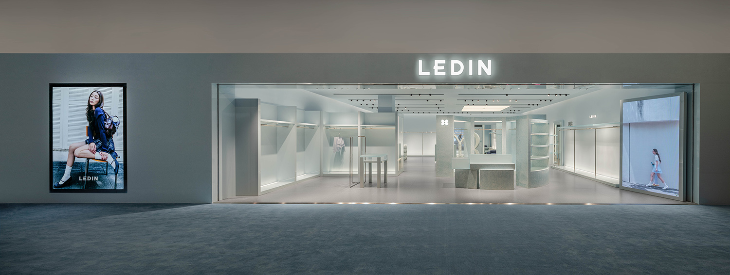
“学而时习之,不亦乐乎”中“习”本义为羽鸟试飞之姿,隐喻在不断练习后终获翱翔之乐。LEDIN 2025全新店务系统借此东方哲思诠释快乐定义,将“自由”与“成长”转译为空间语言。“乐天蓝”作为主色,不仅是色彩选择,更是品牌精神的视觉化表达。
In the phrase “To learn and to practice constantly, is this not a joy?” the character xi (习) originally refers to the image of a young bird learning to fly—an apt metaphor for the joy found through repeated practice and eventual freedom. Inspired by this Eastern philosophy, LEDIN’s 2025 retail system redefines joy by translating the concepts of “freedom” and “growth” into spatial language. The primary color “Letian Blue” is more than a visual choice—it is a vivid expression of the brand’s spirit.
∇ 空间概览(图片@汪敏杰) Space Overview Elevation © Minjie Wang
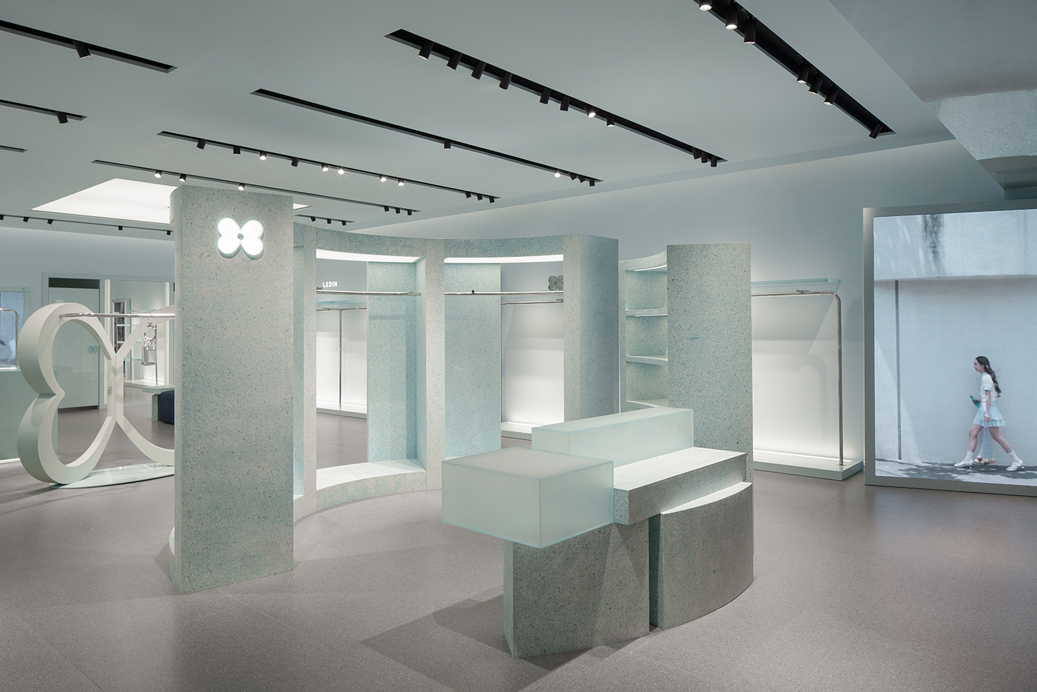
入口圆形展区系统打破边场延续线性排列的传统布局,将海洋生态的物理分布转化为空间语法,强化空间连续性,体现自然界的无限生长,乐无止尽。
The circular display system at the entrance breaks away from the traditional linear layout of peripheral zones, transforming the physical patterns of marine ecology into spatial grammar. This approach enhances spatial continuity and reflects the boundless growth found in nature—capturing the essence of joy without limits.
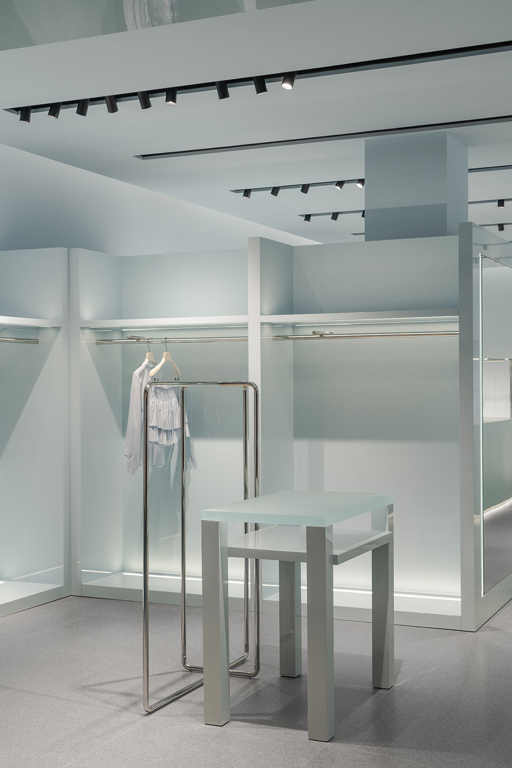
∇ 内部空间(图片@汪敏杰) Interior space Elevation © Minjie Wang
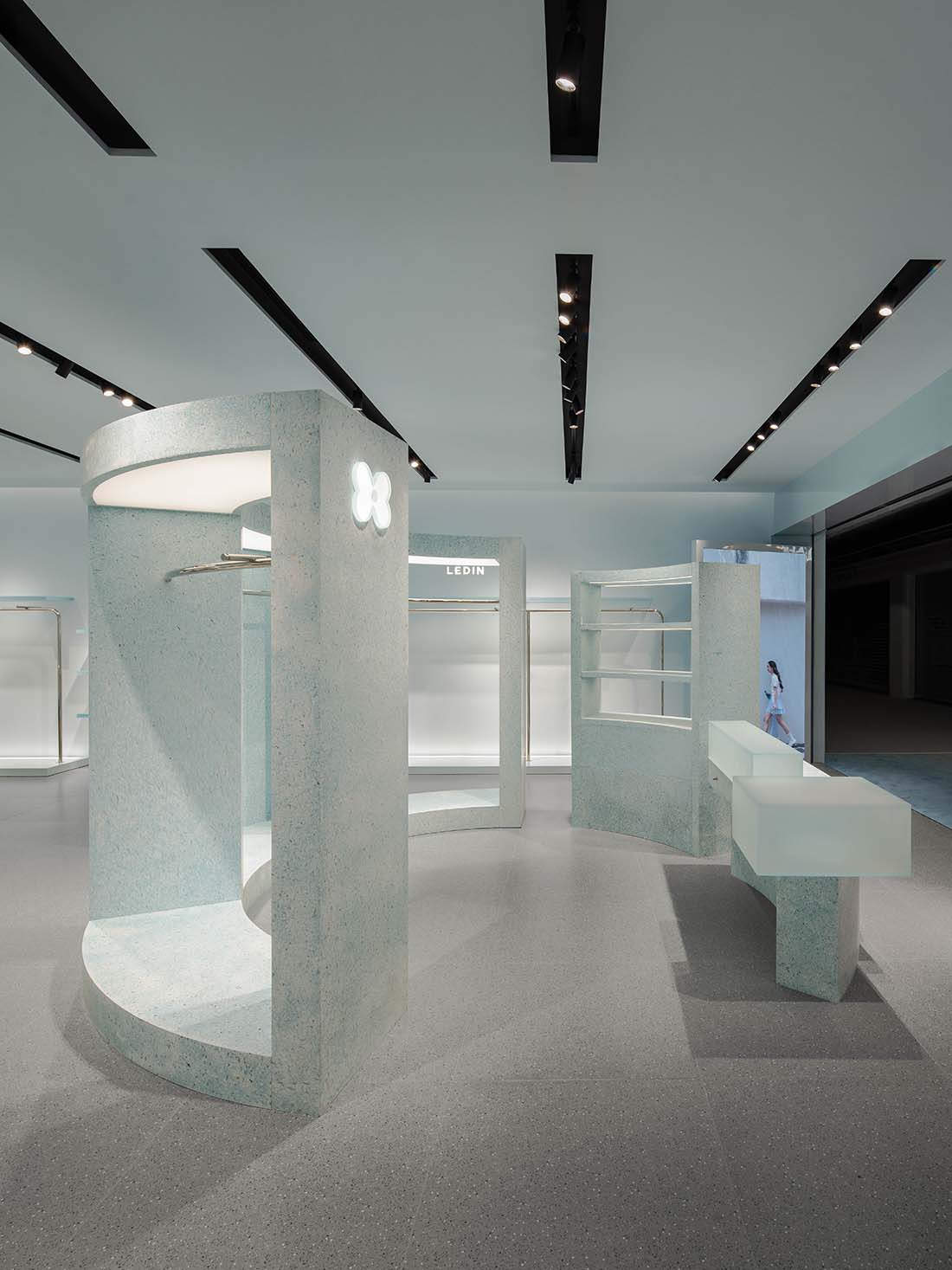
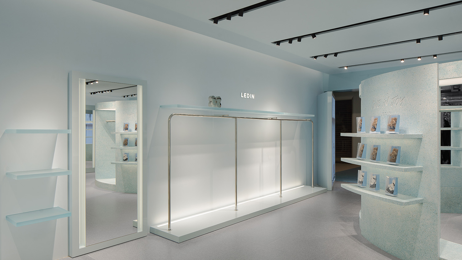
通过解构天空意象,空间以直线与弧线构建空间骨架:直线象征当代女性的清晰自我,曲线代表内在柔软与生命力,在主色“乐天蓝”的统一下形成有层次的视觉引导,强化顾客的动线体验与场景转化。
By deconstructing the imagery of the sky, the space is structured through a dynamic interplay of straight and curved lines: straight lines symbolize the clarity and self-awareness of modern women, while curves represent inner softness and vitality. Unified by the brand’s signature “Letian Blue,” this layered visual language enhances customer flow and transitions between scenes, creating an immersive and fluid spatial experience.
∇ 内部空间(图片@汪敏杰) Interior space Elevation © Minjie Wang


评论(0)